How we look.
How we sound.
The brand of Cycling Hawaiʻi, rendered live. Colors, typography, voice, visual patterns. The page itself is designed in the system it documents.
The Logo
The orange scarab + a tight wordmark in two weights. The icon references the bike Vini named Scarab. The wordmark uses Space Grotesk Bold with strava-orange treatment on HAWAII.
 CYCLINGHAWAIICYCLINGHAWAII
Minimum padding around the logo equals the height of the icon.
Wordmark legible down to ~120px wide. Below that, use the icon alone.
Don't recolor the icon, stretch the wordmark, or split the lockup.
Colors
Seven core tokens drive 95% of the site. The accent palette categorizes ride types and event categories. Strava orange is the brand identity — every dual-color title, every CTA, every eyebrow.
Typography
Two fonts. Space Grotesk for everything that needs to feel built. Inter for everything that needs to be read. Italic is reserved for Laura's voice.
Headings, hero titles, big numbers, eyebrows. Geometric, modern, slight tech edge. Weights used: 500, 600, 700.
Google Fonts →Body copy, labels, paragraphs. Neutral, highly legible at all sizes, optical-sized for screens. Weights: 300, 400, 500, 600, 700.
Google Fonts →Voice
Two voices working in concert. Vini founds and signs. Laura runs the rest.
Third person about Vini. Dry. Witty. Unimpressed by default. Sparingly impressed. Roasts with love. Specific data over generalities. AI bookkeeper energy.
First person. Humble. Irreverent. Maui-rooted. Hawaiian language sprinkled (mahalo, e komo mai, ʻāina, pono). Three short clauses → one punchline.
- • Em-dash for the punchline. Three short clauses, then the wink. "Just miles, weather, and the audacity..."
- • Specifics over generalities.“94 mi at 6,626 ft” beats “a hard ride.”
- • Italics signal Laura.If it's in italics, she's saying it.
- • Sprinkle, don't saturate Hawaiian. Mahalo in the right place beats aloha sprinkled everywhere.
- • Never hype. Cycling is the baseline, not the achievement.
Visual Patterns
Five recurring patterns make every page recognizable as Cycling Hawaiʻi, regardless of content.
The defining noun (or verb) gets strava-orange. Bold black for context, orange for identity. Used on every hub-page hero.
Above every section title. Uppercase, letter-spacing 0.3em, strava color. Sets context before the headline.
from-strava/10 → bg → bg, vertical. Used on every hub page. Warms the page without overwhelming.
List three short clauses, then em-dash, then the wink clause.
Miles, weather, rainbows, coffee tours — and the audacity to call it a club.
Pill-shaped, soft /15 background + matching text color. Categorical labels across the site.
Italicized text, mist-gray, with a small strava-orange marker icon in a circle. Indicates Laura is speaking.
Trades are honking. Tailwind toward Hāna — go take the bait.
Imagery
Photography style — the look and feel that makes a Cycling Hawaiʻi photo recognizable as one. Real reference imagery added after the May 24 / 26 shoots.
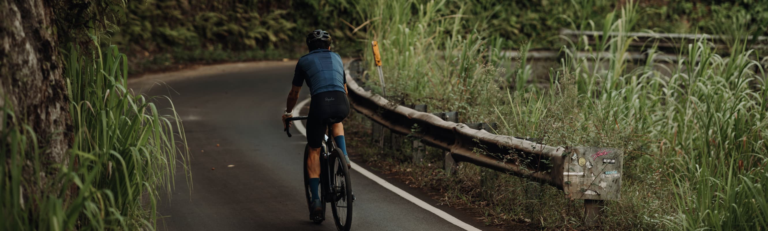
Solo rider in landscape. Shallow DoF. Backlit jungle. Rider as part of the environment, not the focus.
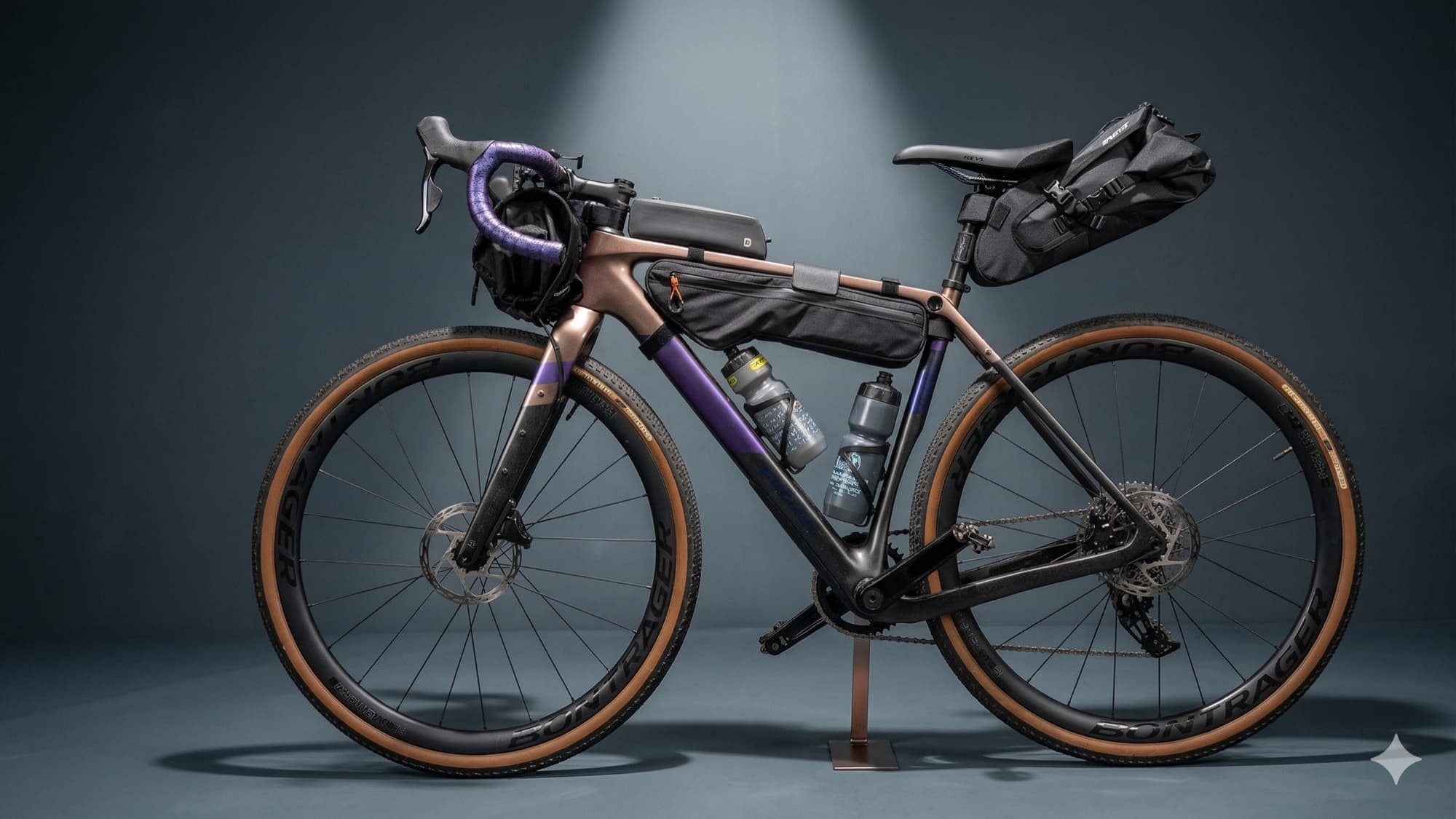
Studio-clean. Warm rim light. Bike as character, not catalog object.
Golden hour preferred. Backlit OK. Avoid harsh midday. Long shadows welcome.
Saturated warm tones. Never crushed black. Skin tones natural.
Rider as small element vs landscape. Or shallow DoF for portraits. Avoid centered hero shots.
Solitude, scale, texture, earned. Never aspirational or stocky.
Don'ts
The crisp list of what to avoid. The brand becomes itself by what it refuses, as much as what it embraces.
The brand evolves with the rides.
This page renders live from the codebase — change a token, the brand book updates. After the May 24 / 26 shoots, the imagery section gains real Cycling Hawaiʻi references.
Designers, sponsors, collaborators — share this URL. cyclinghawaii.com/brand